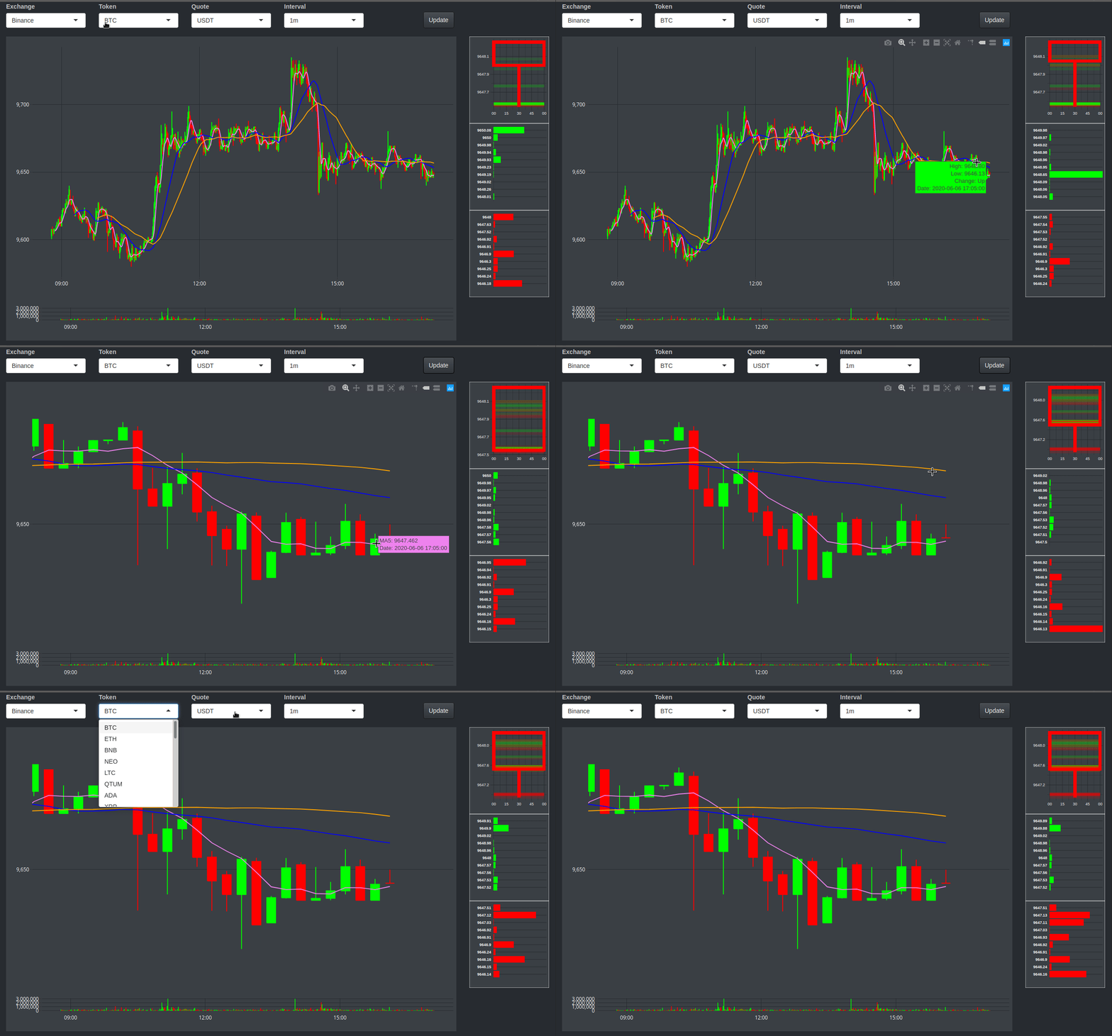
I have spent more time that I’ll ever admit looking at cryptocurrencies trading charts. I’ve been working with Shiny for more than a year by now. So finally I tried to put cryptocurrencies and Shiny together and create my own trading chart in Shiny. Let’s say it won’t be used by any professional trader. It’s slow and ugly, but it’s mine.
From scratch
Unlike other posts, I’ll try to make this one short and to the point. Here is the app deployed in Shinyapps.io, ShinyCandles. Beware the site sucks in your phone.
Because I don’t know if Shinyapps.io will handle ShinyCandles properly or if the Binance’s API or websocket specification will change breaking the app, this is the look of ShinyCandles run locally today.

I created a quite simple trading chart from scratch using Shiny in R. ShinyCandles is build on 5 interconnected blocks:
- Selectors
- Candles
- Volume
- Candle generation
- Order book
Selectors
It’s by far the most simple part of ShinyCandles. It allows the user to select the exchange (just Binance so far, but I’m planning to add Kraken), the token, the quote of that token, and the interval of time by which the candle will be requested and drawn in the chart.
Candles
Candles are the graph that will allow the trader to check the trading history of the selected token and quote at the interval of time indicated before. All the information is collected from the API opened by Binance (info about it here).
The main function to make it work is as follows:
getOHLCBinance <- function (interval, pairSelected) {

   path <- "https://api.binance.com/api/v1/klines?symbol="
   raw_OHLCtmp <- data.frame("status_code" = NA)

   # Different ways of getting the OHLC
   tryCatch (raw_OHLCtmp <- GET (paste0 (path, pairSelected, "&interval=", interval)),
             error = function (e) NULL)

   if (raw_OHLCtmp$status_code == 200) {
      OHLCtmp <- rbindlist (content (raw_OHLCtmp))

   } else {

      Sys.sleep (1)
      tryCatch ({
         pndfile <- './pndfile.json'
         download.file (paste0 (path, pairSelected, "&interval=1m&startTime=", since),
                        pndfile, quiet = T, method = url.OS ())
         OHLCtmp <- as.data.table (fromJSON (paste0 (pndfile)))
      },
      error = function (e) NULL)
   }

   if (is.null ("OHLCtmp")) {
      Sys.sleep (1)
      OHLCtmp <- as.data.table (fromJSON (paste0 (path, pairSelected, "&interval=1m&startTime=", since)))
   }

   OHLCtmp <- OHLCtmp [, c(1:8)]
   OHLCtmp <- as.data.table (sapply (OHLCtmp, as.numeric))

   setnames (OHLCtmp,
             c ("V1", "V2", "V3", "V4", "V5", "V6", "V7", "V8"),
             c ("Time", "Open", "High", "Low", "Close", "VolumeToken", "CloseTime", "VolumeBase"))

   OHLCtmp [, pair := pairSelected]
   OHLCtmp [, exchange := "Binance"]
   OHLCtmp [, Time := Time/1000]

   ###### Add more indicators!
   OHLCtmp [, Change := ifelse ( (Open >= Close), "Down", "Up")]
   OHLCtmp [, MA5 := roll_meanr ( (Open + Close)/2, n = 5, fill = NA, na.rm = T), by = c ("exchange", "pair")]
   OHLCtmp [, MA30 := roll_meanr ( (Open + Close)/2, n = 30, fill = NA, na.rm = T), by = c ("exchange", "pair")]
   OHLCtmp [, MA60 := roll_meanr ( (Open + Close)/2, n = 60, fill = NA, na.rm = T), by = c ("exchange", "pair")]
   OHLCtmp [, Date := lapply (.SD, function (x) as.POSIXct(x, origin="1970-01-01")), .SDcols = "Time"]

   return (OHLCtmp)
}
Because the API is not as reliable as I’d like, I tried to make the request in several ways just in case one of them fails. Also I use the same function to add some basic indicators (Moving Averages) that will be shown in the graph. Yes, I know they don’t have a legend, but now you know what they are.
The function to create the graph itself is quite simple, but here it is:
createVelasGraph <- function (OHLC){
   velasGraph <- ggplot (data = OHLC, aes (x = Date) ) +
      geom_linerange (aes (ymax = High, ymin = Low, color = Change)) +
      geom_rect (aes (xmin = as.POSIXct(Time - (30 * 0.6), origin="1970-01-01"),
                      xmax = as.POSIXct(Time + (30 * 0.6), origin="1970-01-01"),
                      ymin = pmin (Open, Close), ymax = pmax (Open, Close),
                      fill = Change,
                      color = Change))+
      geom_line (aes (y = MA5), color = "violet")+
      geom_line (aes (y = MA30), color = "blue")+
      geom_line (aes (y = MA60), color = "orange")+
      scale_fill_manual (values = c ("Down" = "red", "Up" = "Green"))+
      scale_color_manual (values = c ("Down" = "red", "Up" = "Green"))+
      themeShinyWhales +
      labs (x = "", y = "") +
      guides (fill = FALSE, color = FALSE) +
      scale_y_continuous(position = "right", labels = scales::comma)
   hide_legend(ggplotly(p = velasGraph))
}
The last line (hide_legend) avoids the legend shown by ggplotly even though guides are set to FALSE in ggplot.
Volume
The volume graph is, IMHO, the most important graph to look at. However, it the ugliest in ShinyCandles. I have to say it didn’t get too much attention and I even thought of removing it. But well, here is the code to generate it:
createVolumeGraph <- function (OHLC){
   volumeGraph <- ggplot (data = OHLC, aes (x = Date) ) +
      geom_col(aes (y = VolumeBase, fill = Change)) +
      themeShinyWhales +
      scale_fill_manual (values = c ("Down" = "red", "Up" = "Green")) +
      labs (x = "", y = "") +
      guides (fill = F, color = F) +
      scale_y_continuous(position = "right", labels = scales::comma)
   hide_legend(ggplotly(p = volumeGraph))
}
I has so much room for improvement.
Candle generation
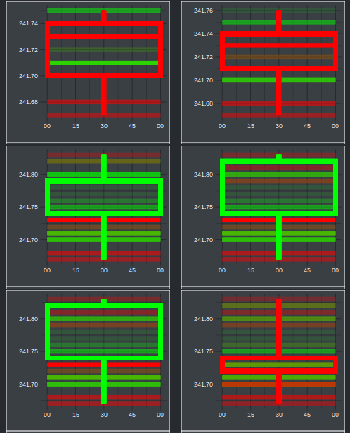
This is a graph that is not very common on other charts. However, it helps to understand candles for newcomers. For the indicated period of time, each trade is considered to be part of the candle: The first trade will be the “Open” price of the candle (in this graph the opening trade is highlighted and it’s fixed during the creation of the candle), the trade executed with the highest price of the period will be the “High” price (it’s the very point of the wick of the candle), the lowest price will be the “Low” (the “High’s” counterpart), and finally the last trade of the period will be the “Close” price (if the “Close” is higher that the open, the candle will be green, red otherwise).

This graph, along the order book, was the real challenge of ShinyCandles. Both of them are created in real time using a connection to Binance’s websockets (more info here). I think I pushed R and Shiny over their comfort zone here, but they could do it. I used websocket library. I couldn’t find many documentation about it, but I could make it work for me.
After open the websocket connection with Binance and making the object tradesTabToReturn reactive, I modified it with the following function:
updateTrades <- function(wsTrades){
   tradesTab <<- copy(tradesTabBlank)
   wsTrades$onMessage(function(event) {
      singleTrade <- as.data.table (fromJSON (event$data), data.table = F)

      names (singleTrade) <- tradesNames
      singleTrade <- singleTrade [, (tradesNums) := lapply (.SD, function (x) as.numeric(as.character(x)))
                                  , .SDcols = tradesNums]
      singleTrade <- singleTrade [, c(tradesDate) := lapply (.SD, function (x) as.POSIXct(x/1000, origin="1970-01-01"))
                                  , .SDcols = tradesDate]
      singleTrade$BuyerMaker <- ifelse (singleTrade$BuyerMaker == 1, "TRUE", "FALSE")

      tradesTab <<- rbind (tradesTab, singleTrade)
      #It will trigger the UI to create the graph velaForming
      reactiveTrades$trades <<- tradesTab

      if (difftime(max(tradesTab$EventTime), max (OHLC$Date), units = "secs") > 60){
         tradesTab <<- copy(tradesTabBlank)
         reactiveTrades$trades <<- tradesTab
      }
   })
}
I keep thinking the function is not very elegant, but it works as intended. Just by putting the reactiveTrades in a observe in the main server.R file inside a function to create the plot, it will be generated every time a trade is executed. The downside of it is that many trades in a period of time will overload ggplot and it won’t render it properly. Probably I should switch to other library to create the graph. But I learned, which is the point.
Order book
This graph follows the same philosophy than the candle creation one. It opens a connection with Binance websockets and modify a reactive object that will be used to create the graph. Both Asks and Bids are collected from the same connection, but they are rendered separately. A quite simple graph is generated with this function:
createAsksPlot <- function (asks) {
   if(nrow(asks) == 0) return()
   ggplot (data = head (asks, 10), aes (x = as.factor(AskPrice), y = as.numeric(AskVolume))) +
      geom_bar (stat = "identity", fill = "green") +
      labs (x = "", y = "") +
      themeShinyWhales +
      theme (axis.text.x = element_blank (),
             axis.ticks.x = element_blank (),
             axis.text.y = element_text(face = "bold")) +
      scale_y_discrete(limits = c(0, as.numeric(maxOrder))) +
      coord_flip ()
}
So many things to do
The list of things to do is longest that the list of done things. Here is a list I’d like to add to ShinyCandles:
- Graphs generation should be faster. Perhaps ditching ggplot2.
- Graphs should not be a picture!
- More exchanges to choose from.
- When the candle section is re-rendered, the focus shouldn’t be lost.
- The volume graph needs a face lifting. Have you seen the y-axis label. Shame on you.
- The order book can be less boring and indicates the volume of each bar.
- Shinyapps.io is free and convenient, but slow as hell.
- Add more indicators, not just the Moving average. Let the user select which ones.
- Improve responsiveness of the site. Not bad, not great.