Introduction
A few months ago I got my hands on a real estate dataset. I had no clue about its structure, meaning, units, and whatnot. After a lot of exploratory analysis, a pinch of mapping, and a grain of modeling, I could get and idea of where to invest in real estate in Barcelona, although in 2016.
0) Boring stuff. Loading libraries and data
First of all, I will load the libraries I’ll be using for the analysis
data.table: Load and handling of data sets.ggplot2: Graphics.caret: Machine learning.ggmap: Creation of maps.RcppRoll: Moving averages.scales: Correct representation of scales for the graphs.
packages <- c ("data.table", "ggplot2", "caret", "ggmap", "RcppRoll", "scales")

usePackage <- function (p) {

  if ( !is.element (p, installed.packages()[,1])) {
    suppressPackageStartupMessages (install.packages (p, dep = TRUE))
  }
  require(p, character.only = TRUE)
}

for (p in packages) {
  usePackage (p)
}
Load the data set itself realEstateData.csv:
realEstateData <- fread ("./data/realEstateData.csv")Something really important to guarantee reproducibility is to set a seed. Also, I’ll avoid scientific notations for large numbers so it’s easier on the eye.
options (scipen = 999)
set.seed (4738)
1) Hands on. Exploratory Data Analysis
I knew very little about the data set, but after a summary and a str to the dataset, I could get some interesting information about the data it seems to be a series of features from real estate located in Barcelona.
Let’s assume the meaning of the variables from their name and format.
id: Number of reference of the property.month_year: Month and year of the case.f_height: Floor height (BJ= “Bajo”, at ground level;EN= “Entresuelo”, between ground and 1st floor).city: City/town.p_code: Postal code.province: Province.re_type: Property type, either house or apartment.p_sold: Selling price (Euros).sold_date: When the property was sold (yyyy-mm-dd).reg_date: When the property was registered or listed (yyyy-mm-dd).surf_area_m2: Floor area (m²).rooms_num: Number of rooms.bathrooms_num: Number of bathrooms.elevator: Presence of elevator.garage: Presence of garage.lat: Latitude.long: Longitude.
Checking the output of the summary and the internal structure of the imported dataset, I saw there were some variables that should be factors instead (e.g. id or garage).
So I transformed to factor the selected variables.
var2fac <- c ( "id", "month_year", "city", "p_code", "province",
               "re_type", "elevator", "garage")

realEstateData <- realEstateData [, (var2fac) := lapply (.SD, factor), .SDcols = var2fac]
To ease the analyses, I transformed the floor height into a numeric variable. Also, I replace the BJ by a value of 0 and EN by 0.5.
realEstateData$f_height [realEstateData$f_height == "BJ"] <- 0
realEstateData$f_height [realEstateData$f_height == "EN"] <- 0.5
realEstateData$f_height <- as.numeric (realEstateData$f_height)
The variable month_year is a date, but not in the right format. Yes, right because there are “right” and “wrong” formats. The RIGHT date format is composed of year, month, and day.
realEstateData$month_year <- ordered (realEstateData$month_year)There are two other features representing a date. I assign the right class to them.
realEstateData$sold_date <- as.Date (realEstateData$sold_date, "%Y-%m-%d")
realEstateData$reg_date  <- as.Date (realEstateData$reg_date,  "%Y-%m-%d")
Now that the data set seems to be in a better shape, I create some basic graphs to get a sense of it.
featurePlot (x = realEstateData [, c ("f_height", "surf_area_m2", "rooms_num", "bathrooms_num")],
             y = realEstateData$p_sold,
             plot = "pairs")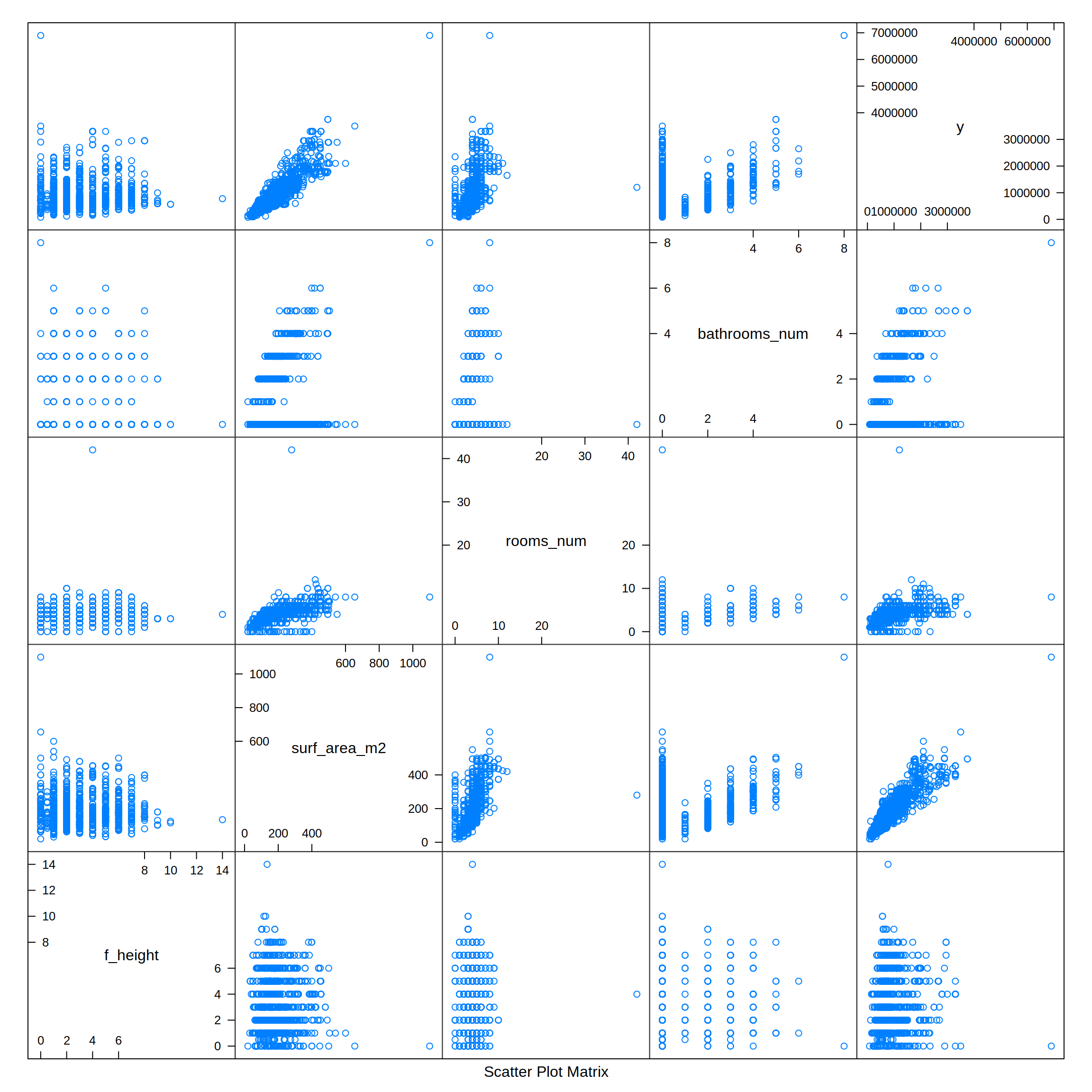
From the previous combined plot I can see that some potential significant relationships could exist. The y value (p_sold, selling price) has a positive correlation with the number of bathrooms (bathrooms_num), rooms (rooms_num), and especially with the floor area (surf_area_m2).
Looking at the dates where the properties were listed and sold, there are some peaks and valleys, but data from a longer period would be needed to obtain a clear tendency (if any).
realEstateDataMelted <- melt (realEstateData,
                              id.vars       = "id",
                              measure.vars  = c ("sold_date", "reg_date"),
                              value.name    = "Date",
                              variable.name = "Type")

realEstateDataMelted$Type <- ifelse (realEstateDataMelted$Type == "sold_date", "Sold", "Listed")

ggplot (data = realEstateDataMelted) +
  geom_histogram (aes (x = Date, fill = Type),
                  stat     = "bin",
                  bins     = 30,
                  lwd      = 2,
                  alpha    = 0.7,
                  position = position_dodge (width = 20)) +
  scale_x_date (date_labels = "%Y-%m",
                date_breaks = "3 month",
                date_minor_breaks = "1 month") +
  labs (title = "Number of properties registered and sold by date",
        x     = "Date",
        y     = "Number of properties") +
  scale_fill_brewer(palette = "Set1")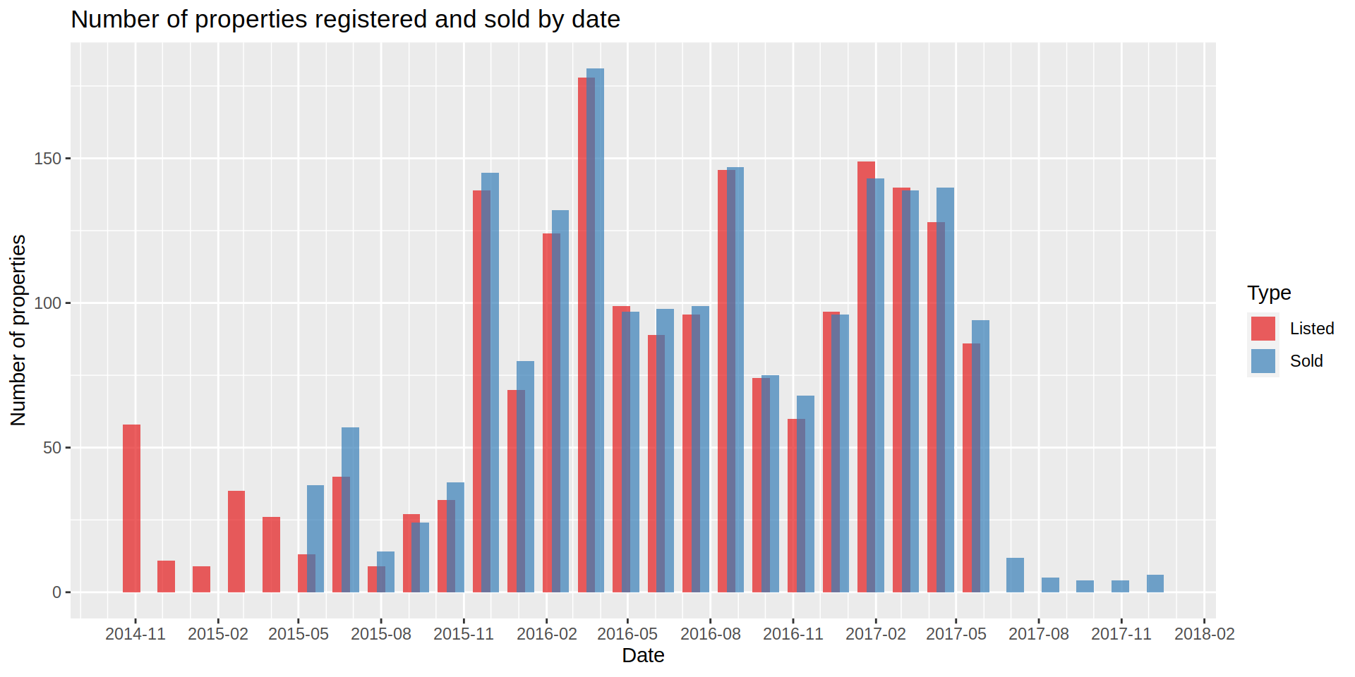
Since the latitude and longitude of each property is on the data set, I map the listing to be able to obtain some insights from the data.
Once here, I realized some of the values, both for latitude and longitude, were 0. I located them and impute them to a possible value using the rest of the variables as predictors. Although slow in my machine, I used a generalized boosted regression (gbm) to get the latitude and longitude values of those missing observations.
Once the values of the coordinates seem correct, I map the cases and color them by their prices. I am removing a price outlier (+6M Euros) so the continuous scale shows the smaller differences better among the rest of the properties.
bcnMap <- get_map (location = c (left = 2.1008333, top = 41.423839,
                                 right = 2.1908333, bottom = 41.377839),
                   zoom     = 12,
                   maptype  = "toner-lite",
                   source   = "stamen",
                   color    = "bw")

ggmap (bcnMap) +
  geom_point (data = realEstateData [!realEstateData$p_sold > 6000000],
              aes (x = long, y = lat, color = p_sold)) +
  scale_colour_continuous (type = "viridis", labels = comma) +
  labs (x     = "Latitude",
        y     = "Longitude",
        title = "Location and price for each property",
        color = "Price (Euros)")
# Warning: Removed 7 rows containing missing values (geom_point).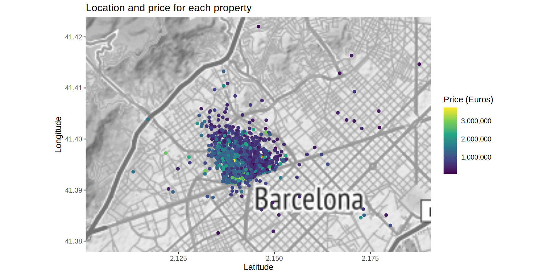
The map shows a property located at the “Barcelona - El Prat Airport”. I can’t say it is misplaced so I won’t remove it or try to change it, but I create a new map focused on the city of Barcelona (specifically at the Sant Gervasi - Galvany neighborhood) where most of the cases are located.
bcnMap_SGG <- get_map (location = c (left = 2.1288333, top = 41.405839,
                                     right = 2.1538333, bottom = 41.389839),
                       zoom     = 12,
                       maptype  = "toner-lite",
                       source   = "stamen",
                       color    = "bw")

ggmap (bcnMap_SGG) +
  geom_point (data   = realEstateData [!realEstateData$p_sold > 6000000],
              aes (x = long, y = lat, color = p_sold),
              na.rm  = TRUE,
              alpha  = 0.7,
              size   = 4) +
  scale_colour_continuous (type = "viridis", labels = comma) +
  geom_segment (data = data.frame (x = 2.130, y = 41.4055, xend = 2.151, yend = 41.390),
                aes (x = x, y = y, xend = xend, yend = yend),
                color = "red", lwd = 1.5) +
  labs (x     = "Latitude",
        y     = "Longitude",
        title = "Location and price for each property",
        color = "Price (Euros)")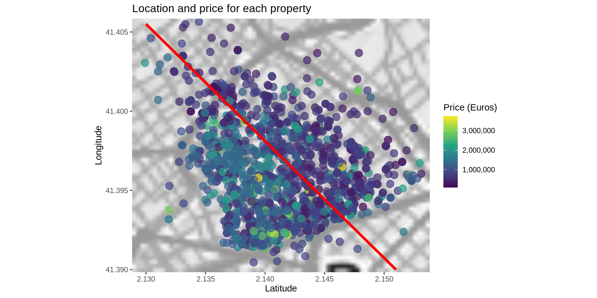
From a closer view, it seems there is a possible separation toward the center of the map where the properties located on the north-eastern section are cheaper than the located on the south-western section. Either the properties on this area are cheaper or they are smaller. If the separation is visible even considering the floor area, it could mean that the south-western area is more expensive.
I recreate the same map, but this time using the floor area (surf_area_m2, m²).
ggmap (bcnMap_SGG) +
  geom_point (data   = realEstateData [!realEstateData$p_sold > 6000000],
              aes (x = long, y = lat, color = surf_area_m2),
              na.rm  = TRUE,
              alpha  = 0.7,
              size   = 4) +
  scale_colour_continuous (type = "viridis", labels = comma) +
  geom_segment (data = data.frame (x = 2.130, y = 41.4055, xend = 2.151, yend = 41.390),
                aes (x = x, y = y, xend = xend, yend = yend),
                color = "red",
                lwd   = 1.5) +
  labs (x     = "Latitude",
        y     = "Longitude",
        title = "Location and area floor for each property",
        color = "Floor area (m²)")
# Warning: Removed 1 rows containing missing values (geom_segment).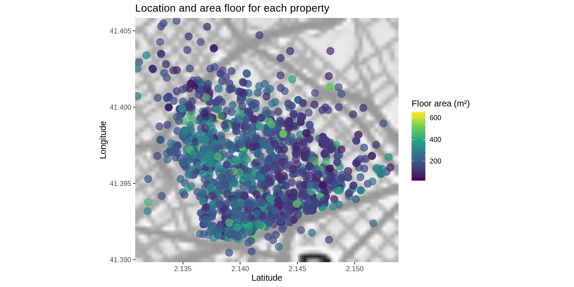
Although the difference looks smaller, the south-western area tends to have larger floor plans.
To discard the possible difference of the floor area between areas, I map the price per squared meter.
ggmap (bcnMap_SGG) +
  geom_point (data   = realEstateData [!realEstateData$p_sold > 6000000],
              aes (x = long, y = lat, color = p_sold / surf_area_m2),
              na.rm  = TRUE,
              alpha  = 0.7,
              size   = 4) +
  scale_colour_continuous (type = "viridis", labels = comma) +
  geom_segment (data = data.frame (x = 2.130, y = 41.4055, xend = 2.151, yend = 41.390),
                aes (x = x, y = y, xend = xend, yend = yend),
                color = "red", lwd = 1.5) +
  labs (x     = "Latitude",
        y     = "Longitude",
        title = "Location and floor price (Euros/m²)",
        color = "Price (Euros)")
# Warning: Removed 1 rows containing missing values (geom_segment).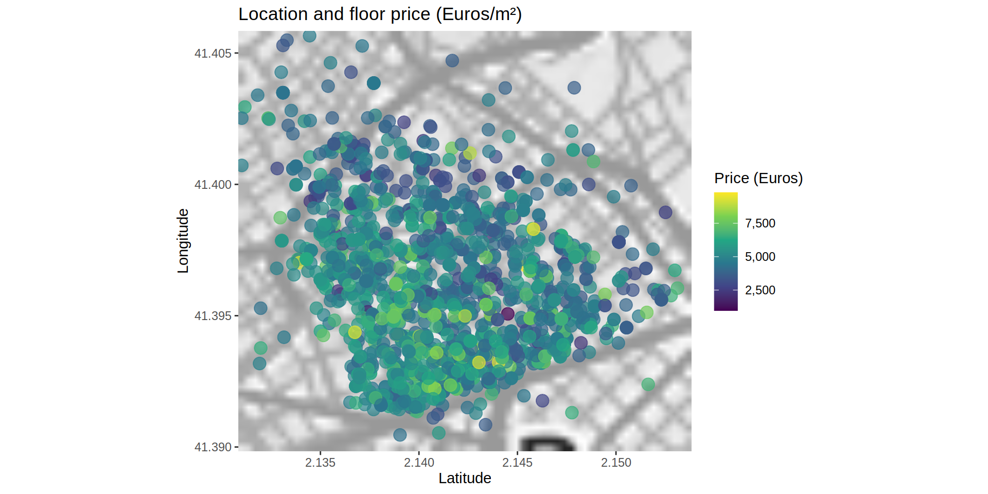
Actually, the difference between areas persists, so the location of each property must be taken into account to be able to predict the price.
2) Throwing some models to the data. Modelling
Before splitting the data into training and testing set, I impute the empty values (NAs) from the f_height variable using the K-Nearest Neighbors fitting technique.
toRemovePiso <- c ("p_sold", "id")

mdKnnPiso <- train (as.factor (f_height) ~ . ,
                    data   = realEstateData [!is.na (realEstateData$f_height), !toRemovePiso, with = FALSE],
                    method = "kknn")

realEstateData$f_height [is.na (realEstateData$f_height)] <- predict (mdKnnPiso, realEstateData [is.na (realEstateData$f_height)])
Using the createDataPartition function from the caret package, I select the cases that will define both, training and testing, data sets.
inTrain <- createDataPartition (y = realEstateData$p_sold, p = 0.7, list = FALSE)To train the model, I remove the id variable since it is not related to any characteristic of the property. Also, I remove some highly correlated variables such as month_year (related to reg_date). I also log-transform the area variable (surf_area_m2) to minimize its range and improve the predictions.
training <- realEstateData [inTrain, -c ("id", "month_year")]
training$surf_area_m2 <- log (training$surf_area_m2)

testing <- realEstateData [-inTrain, -c ("id", "month_year")]
testing$surf_area_m2 <- log (testing$surf_area_m2)
I train the model using four different algorithms:
- A simple generalized linear model with step-wise feature selection (
glmStepAIC). It will select different features and run a linear model. Then, it will compare the Akaike information criterion (AIC) to select the one which explains more variance of the response with the fewer number of features. - Elastic linear regression (
glmnet). Linear regression penalizing the maximum likelihood regularizing the search with a lasso or elastic penalty grid. - Generalized boosted regression modeling (
gbm): Creates a model from the combination of several weak predictive models. - Random forest (
rf): Random selection of features to build several decision trees to construct a consensus tree from all of them.
Since the number of cases could be considered small, I am using a resampling method to calculate the metrics to evaluate each model. For every possible algorithm I use an adaptive cross-validation technique with 10 resampling iteration and a random search.
control <- trainControl (method = "adaptive_cv",
                         number = 10,
                         search = "random",
                         verboseIter = FALSE)
Model from mStepAIC:
mdLogPiso_lmStepAIC <- train (log (p_sold) ~ .,
                              data   = training,
                              method = "lmStepAIC",
                              trainControl = control,
                              trace  = FALSE)
Model from glmnet:
mdLogPiso_glmnet <- train (log (p_sold) ~ .,
                           data = training,
                           preProcess = c ("center", "scale"),
                           method = "glmnet")
For the boosting model, I create a grid to optimize the search for the best parameters.
Model from gbm:
gbmGrid <- expand.grid (shrinkage = seq (0.1, 1, by = 0.33),
                        interaction.depth = c (1, 5),
                        n.minobsinnode    = c (1, 5),
                        n.trees = c (300, 500, 1000))

mdLogPiso_gbm <- train (p_sold ~ ., data = training,
                        preProcess = c ("center", "scale"),
                        method     = "gbm",
                        tuneGrid   = gbmGrid,
                        verbose    = FALSE)
Model from rf:
mdLogPiso_rf <- train (p_sold ~ .,
                       data   = training,
                       method = "rf",
                       trainControl = control,
                       trace  = FALSE)
Comparing the four models by their mean root mean square error (RMSE) and their Rsquared:
summary (resamples (list (lm     = mdLogPiso_lmStepAIC,
                          glmnet = mdLogPiso_glmnet,
                          gbm    = mdLogPiso_gbm,
                          rf     = mdLogPiso_rf)))
#
# Call:
# summary.resamples(object = resamples(list(lm = mdLogPiso_lmStepAIC, glmnet
# = mdLogPiso_glmnet, gbm = mdLogPiso_gbm, rf = mdLogPiso_rf)))
#
# Models: lm, glmnet, gbm, rf
# Number of resamples: 25
#
# MAE
# Min. 1st Qu. Median Mean
# lm 0.1840605 0.1906933 0.1950051 0.1948967
# glmnet 0.1878690 0.1917768 0.1945807 0.1950860
# gbm 140923.9664720 146440.5897237 152308.8059192 151217.8280722
# rf 130592.5245910 144953.4648738 147052.6783074 148232.9318365
# 3rd Qu. Max. NA's
# lm 0.1989087 0.2034794 0
# glmnet 0.1993112 0.2026543 0
# gbm 156673.3111742 165031.8583255 0
# rf 153110.9628879 177483.8057812 0
#
# RMSE
# Min. 1st Qu. Median Mean
# lm 0.2380743 0.2461252 0.2535552 0.2526853
# glmnet 0.2378385 0.2427507 0.2499678 0.2505350
# gbm 212855.9899590 220506.6506711 229272.1205822 235968.1547230
# rf 197792.8516643 218247.5610303 232594.0192014 253628.9615705
# 3rd Qu. Max. NA's
# lm 0.2590397 0.2667359 0
# glmnet 0.2549260 0.2631364 0
# gbm 238907.6196662 333082.4570584 0
# rf 305702.2963810 319257.6680614 0
#
# Rsquared
# Min. 1st Qu. Median Mean 3rd Qu. Max. NA's
# lm 0.7725114 0.7834608 0.7974406 0.7963771 0.8097527 0.8220311 0
# glmnet 0.7693294 0.7875116 0.7975466 0.7975251 0.8116596 0.8211739 0
# gbm 0.7144300 0.8324385 0.8394636 0.8365654 0.8539301 0.8769956 0
# rf 0.7472414 0.7804228 0.8337925 0.8196809 0.8498234 0.8708603 0Although the models built with the boosting algorithm (mdLogPiso_gbm) and the random forest one (mdLogPiso_rf) have a greater Rsquared value (they are able to explain a greater variance of the response), they have also a greater RMSE than the other two models. I compare mdLogPiso_lmStepAIC and mdLogPiso_glmnet using a t-test integrated in compare_models.
compare_models (mdLogPiso_lmStepAIC, mdLogPiso_glmnet)#
# One Sample t-test
#
# data: x
# t = 0.82999, df = 24, p-value = 0.4147
# alternative hypothesis: true mean is not equal to 0
# 95 percent confidence interval:
# -0.003196702 0.007497271
# sample estimates:
# mean of x
# 0.002150284The models are not significantly different, so any of them could be used to predict the testing data set. I use the Elastic linear regression model (glmnet).
First, I check how well the model would predict the testing set.
postResample (log (testing$p_sold), predict (mdLogPiso_glmnet, testing))# RMSE Rsquared MAE
# 0.2446423 0.8083850 0.1819006A Rsquared value 0.798 means that the model is able to explain 79.8% of the variation of the response variable (p_sold) from the testing data set. Probably a more in deep optimization with a larger data set could improve this number greatly.
3) Getting the real information. House Price Index
The house price index (HPI) is an indicator of real estate price changes. If the index uses characteristics of the properties sold during a period of time, it is said it uses hedonic regression for its calculation. Given the nature of the given data (characteristics of the property is given but not selling prices of the same property over time), I have followed this methodology to recreate the changes in price of the apartments according to their features.
To calculate a House Price Index (HPI), first of all I transform some of the variables into ones and zeroes.
realEstateData [, elevator := ifelse (elevator == "Si", 1, 0)]
realEstateData [, garage   := ifelse (garage   == "Si", 1, 0)]
Then, I select the features that I use to calculate the HPI for each month, namely p_sold, f_height, surf_area_m2, rooms_num, bathrooms_num, elevator, and garage.
features <- c ("p_sold", "f_height", "surf_area_m2", "rooms_num", "bathrooms_num", "elevator", "garage")From these features, I run a general linear regression taking the price variable (p_sold) as response and the rest of the selected features as predictors. I create new columns with the intercept of the model and the coefficients for each predictor.
for (mon in unique (realEstateData$month_year)) {
  md <- glm (log (p_sold) ~ ., data = realEstateData [realEstateData$month_year == mon, features, with = FALSE])
  realEstateData$I_intercept [realEstateData$month_year == mon] <- md$coefficients[1]
  realEstateData$I_f_height [realEstateData$month_year == mon]    <- md$coefficients[2]
  realEstateData$I_surf_area_m2 [realEstateData$month_year == mon] <- md$coefficients[3]
  realEstateData$I_rooms_num [realEstateData$month_year == mon]       <- md$coefficients[4]
  realEstateData$I_bathrooms_num [realEstateData$month_year == mon]     <- md$coefficients[5]
  realEstateData$I_elevator [realEstateData$month_year == mon]  <- md$coefficients[6]
  realEstateData$I_garage [realEstateData$month_year == mon]    <- md$coefficients[7]
}

realEstateData [, 14:20] <- replace (realEstateData [, 14:20], is.na (realEstateData [, 14:20]), 0)
The intercept and coefficients calculated on the previous step will be used to calculate the index for each month and year (month_year) using as predictors values the mean of each feature during that period of time.
realEstateDataIndex <- data.table (unique (realEstateData [, "month_year"]))

for (nam in names (realEstateData [, -c ("id", "month_year", "lat", "long")])){
  expr <- parse (text = paste0 ("mean (", nam, ", na.rm = TRUE)"))
  tmp <- realEstateData [, eval (expr), by = month_year]
  names (tmp)[2] <- nam
  realEstateDataIndex <- merge (realEstateDataIndex, tmp, by = "month_year", all.x = TRUE)
}

realEstateDataIndex [, pre_Index := I_intercept +
                       (f_height      * I_f_height) +
                       (surf_area_m2  * I_surf_area_m2) +
                       (rooms_num     * I_rooms_num) +
                       (bathrooms_num * I_bathrooms_num) +
                       (elevator      * I_elevator) +
                       (garage        * I_garage)
                     ]
This index calculated for each month will be compared to January 2016 which will be used as the reference point. I removed data from 2014 and 2015 so the first case is January 2016.
To calculate the change of HPI over time, I compare the index for each month and its percentage change to January 2016.
realEstateDataIndex [, index2016 := ((pre_Index / pre_Index [1] ) * 100) - 100]

ggplot (data = realEstateDataIndex, aes (x = sold_date)) +
  geom_point (aes (y  = index2016),
              color   = "blue",
              size    = 3) +
  geom_smooth (method = "loess",
               aes (x = sold_date, y = index2016),
               color  = "blue") +
  scale_x_date (date_labels = "%Y-%m",
                date_breaks  = "3 month",
                date_minor_breaks = "1 month") +
  labs (x     = "Selling date",
        y     = "Percent change",
        title = "Variation of Housing Price Index")
# `geom_smooth()` using formula 'y ~ x'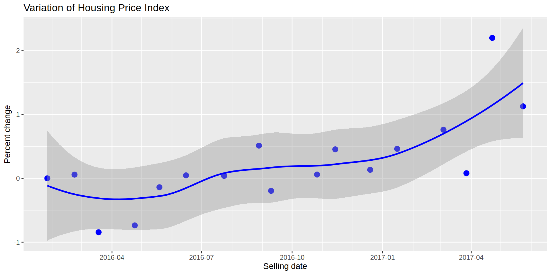
The previous plot shows a zig-zag at a lower level, but a clear uptrend, meaning that the expected value of the properties for the “average” household is increasing compared to January 2016. A similar tendency is observed if I plot the mean monthly price for the same period of time, we see the price getting more expensive on average.
ggplot (data = realEstateDataIndex, aes (x = sold_date)) +
  geom_point (aes (y  = p_sold),
              color   = "red", size = 3) +
  geom_smooth (method = "loess",
               aes (x = sold_date, y = p_sold),
               color  = "red") +
  scale_y_continuous(labels = comma) +
  scale_x_date(date_labels = "%Y-%m",
               date_breaks = "3 month",
               date_minor_breaks = "1 month") +
  labs (x     = "Selling date",
        y     = "Price (Euros)",
        title = "Price per property")
# `geom_smooth()` using formula 'y ~ x'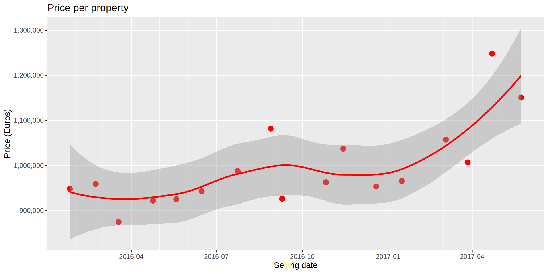
4) Finding the balance. Moving averages
A couple of things I learned from finance is how helpful is observing moving averages. For HPI they could indicate a broader temporal scale that the monthly HPI would tend to follow.
Following this thought, I calculate the moving averages for 3 and 6 months
realEstateDataIndex [, index2016_ma3 := roll_meanr (index2016, 3, fill = NA)]
realEstateDataIndex [, index2016_ma6 := roll_meanr (index2016, 6, fill = NA)]
And I plot the three indexes on the same graph.
ggplot (data = realEstateDataIndex, aes (x = sold_date)) +
  geom_point (aes (y  = index2016),
              color   = "blue", size = 3) +
  geom_smooth (method = "loess",
               aes (x = sold_date, y = index2016),
               color  = "blue") +
  geom_smooth (se     = FALSE,
               method = "loess",
               aes (x = sold_date, y = index2016_ma3),
               color  = "red",
               na.rm = TRUE) +
  geom_smooth (se = FALSE, method = "loess",
               aes (x = sold_date, y = index2016_ma6),
               color  = "orange",
               na.rm = TRUE) +
  scale_x_date(date_labels = "%Y-%m",
               date_breaks = "3 month",
               date_minor_breaks = "1 month") +
  labs (x     = "Selling date",
        y     = "HPI",
        title = "Monthly HPI and 3 and 6-months moving averages")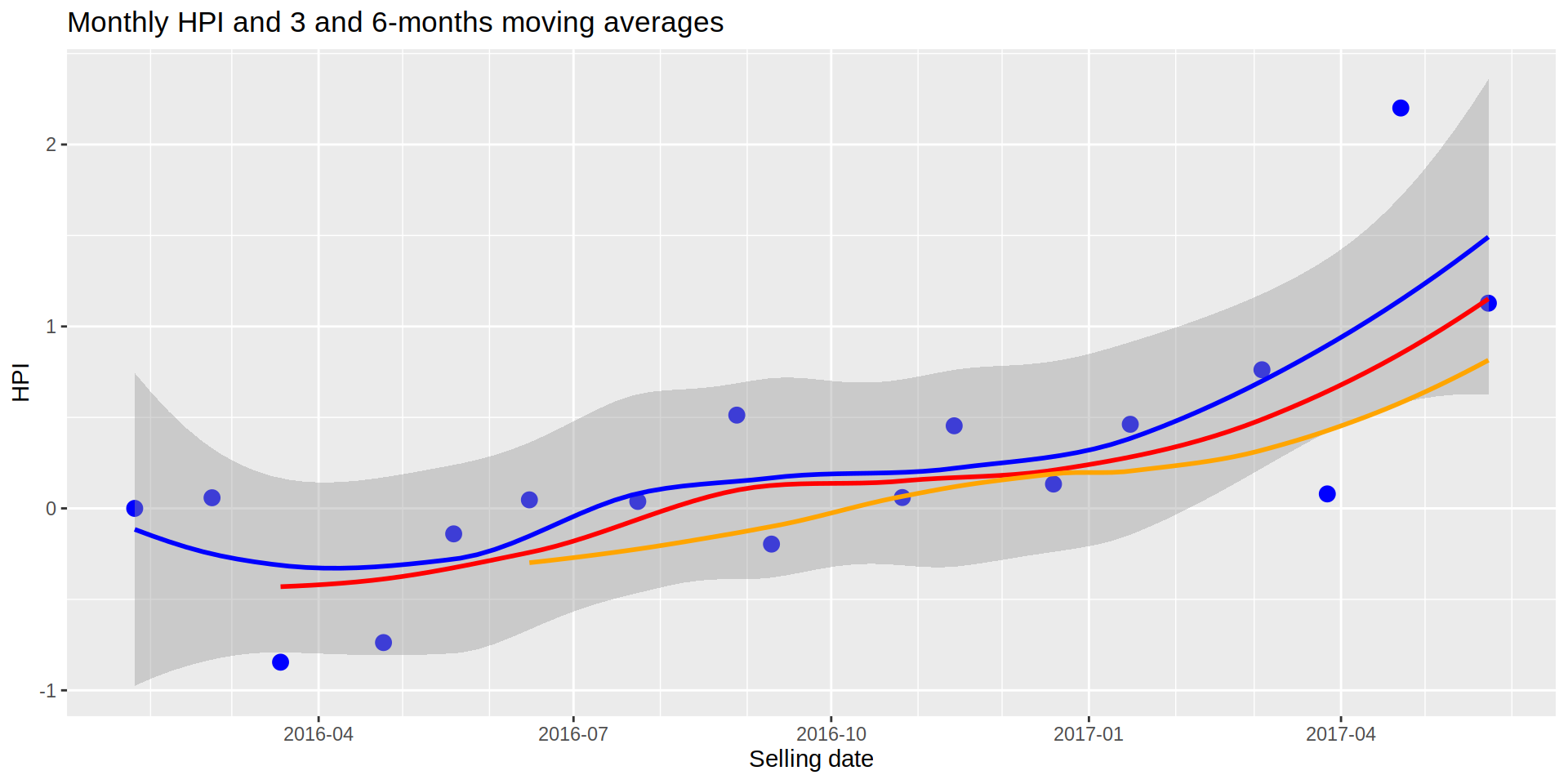
If we think the shorter HPI (1 month, blue line) would tend to follow the more general 3-month trend (red line) and the 6-month HPI (orange line), the graph above would be indicating that the current HPI is over the trend and it should go down in the future. However, there are not many months to get the information from and there are no signs of slowing down as of June 2017, so the increasing of the HPI could continue.
5) Going deeper to find the gold. Mapping HPI
Since the coordinates are available for each case I can assigned each one to a cell, I could calculate the percent change of HPI for each cell. From them I could select the one with the steepest slope, either positive or negative, to detect areas where the trend is favorable for investing.
I create a 100x100 grid where each division will have a code which will be assigned to the properties located in that grid.
grid <- 100
gr_long <- data.table (long = seq (from = min (realEstateData$long),
                                   to   = max (realEstateData$long),
                                   length.out = grid),
                       longCode = 1:grid)

gr_lat <- data.table (lat = seq (from = min (realEstateData$lat),
                                 to   = max (realEstateData$lat),
                                 length.out = grid),
                      latCode = 1:grid)

for (i in 1:nrow (realEstateData)) {
  tmp <- data.table (diff_long = 1:grid, diff_lat = 1:grid)

  for (j in 1:nrow (gr_long)) {
    tmp$diff_long [j] <- realEstateData$long[i] - gr_long$long[j]
  }

  realEstateData$longCode [i] <- gr_long$longCode [which.min (abs (tmp$diff_long))]

  for (h in 1:nrow (gr_lat)) {
    tmp$diff_lat [h] <- realEstateData$lat[i] - gr_lat$lat[h]
  }

  realEstateData$latCode [i] <- gr_lat$latCode [which.min (abs (tmp$diff_lat))]

  rm (tmp)
}

realEstateData [, coorCode := paste (longCode, latCode, sep = "x")]
realEstateData [, c ("longCode", "latCode") := NULL]
I mimic the steps to build the HPI, but this time grouping the cases by month and year and by coorCode.
realEstateDataHpiArea <- copy (realEstateData)
for (mon in unique (realEstateDataHpiArea$month_year)){
  for (ar in unique (realEstateDataHpiArea$coorCode)) {

    setGLM <- realEstateDataHpiArea [realEstateDataHpiArea$month_year == mon &
                                       realEstateDataHpiArea$coorCode == ar,
                                     features, with = FALSE]

    if (nrow (setGLM) == 0) next ()

    md <- glm (log (p_sold) ~ ., data = setGLM)

    realEstateDataHpiArea$I_intercept [realEstateDataHpiArea$month_year == mon &
                                         realEstateDataHpiArea$coorCode == ar] <- md$coefficients[1]
    realEstateDataHpiArea$I_f_height [realEstateDataHpiArea$month_year == mon &
                                        realEstateDataHpiArea$coorCode == ar]    <- md$coefficients[2]
    realEstateDataHpiArea$I_surf_area_m2 [realEstateDataHpiArea$month_year == mon &
                                            realEstateDataHpiArea$coorCode == ar] <- md$coefficients[3]
    realEstateDataHpiArea$I_rooms_num [realEstateDataHpiArea$month_year == mon &
                                         realEstateDataHpiArea$coorCode == ar]       <- md$coefficients[4]
    realEstateDataHpiArea$I_bathrooms_num [realEstateDataHpiArea$month_year == mon &
                                             realEstateDataHpiArea$coorCode == ar]     <- md$coefficients[5]
    realEstateDataHpiArea$I_elevator [realEstateDataHpiArea$month_year == mon &
                                        realEstateDataHpiArea$coorCode == ar]  <- md$coefficients[6]
    realEstateDataHpiArea$I_garage [realEstateDataHpiArea$month_year == mon &
                                      realEstateDataHpiArea$coorCode == ar]    <- md$coefficients[7]
  }
}

realEstateDataHpiArea [, 15:21] <- replace (realEstateDataHpiArea [, 15:21],
                                            is.na (realEstateDataHpiArea [, 15:21]),
                                            0)
realEstateDataHpiArea2 <- realEstateData [, .(.N), by = .(month_year, coorCode)]
realEstateDataHpiArea2 [, N := NULL]
toRemoveHPI <- c ("sold_date", "reg_date", "id",
"month_year", "lat", "long", "coorCode")
for (nam in names (realEstateDataHpiArea [, !toRemoveHPI, with = FALSE])){
expr <- parse (text = paste0 ("mean (", nam, ", na.rm = TRUE)"))
tmp <- realEstateDataHpiArea [, eval (expr), by = .(month_year, coorCode)]
names (tmp)[3] <- nam
realEstateDataHpiArea2 <- merge (realEstateDataHpiArea2, tmp, by = c ("month_year", "coorCode"), all.y = TRUE)
}realEstateDataHpiArea2 [, pre_Index := I_intercept +
(f_height * I_f_height) +
(surf_area_m2 * I_surf_area_m2) +
(rooms_num * I_rooms_num) +
(bathrooms_num * I_bathrooms_num) +
(elevator * I_elevator) +
(garage * I_garage)
]
realEstateDataHpiArea2 <- realEstateDataHpiArea2 [!(grepl ("^2014|2015.*", realEstateDataHpiArea2$month_year))]
realEstateDataHpiArea2 [, index2016_area := ((pre_Index / pre_Index [1]) * 100) - 100,
by = coorCode]Once the HPI is calculated for each area and month, I calculate the mean HPI for each area.
realEstateDataHpiArea2 [, meanHPI_area := mean (index2016_area, na.rm = TRUE),
                        by = coorCode]

realEstateDataHpiArea2 <- merge (realEstateDataHpiArea [, c ("month_year", "coorCode", "sold_date",
                                                             "lat", "long")],
                                 realEstateDataHpiArea2,
                                 by = c ("month_year", "coorCode"))
Mapping the properties and color them by the amount of HPI change from January 2016 (or the earliest month with data from that area).
ggmap (bcnMap_SGG) +
  geom_point (data  = realEstateDataHpiArea2,
              aes (x = long, y = lat, color = meanHPI_area),
              na.rm = TRUE,
              alpha = 0.7,
              size  = 4) +
  scale_colour_continuous (type = "viridis") +
  labs (x     = "Latitude",
        y     = "Longitude",
        title = "Geographical HPI trends",
        color = "HPI change")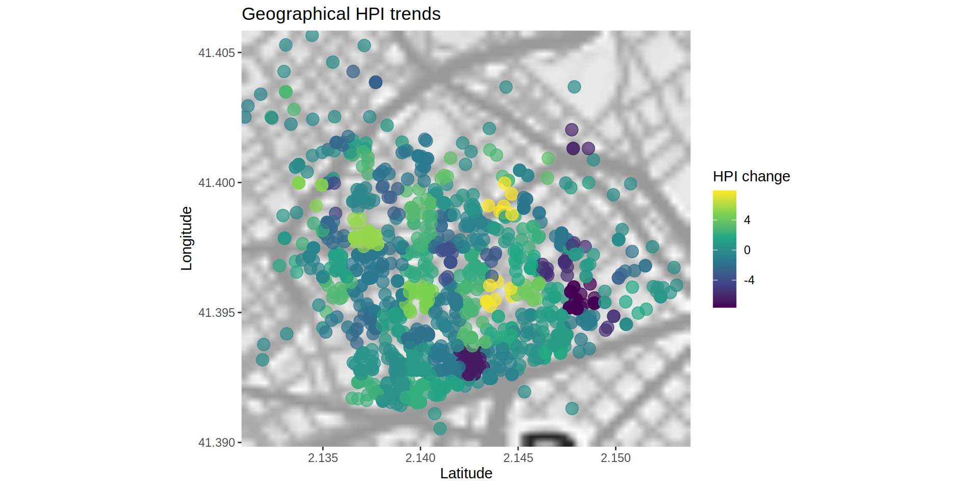
So by the end I got that yellow colors indicate areas where the HPI has increased notably while blue areas show a decrease. Further analyses could indicate if the tendency is stable meaning a business opportunity.
If I could go back to 2016, first I would by some bitcoins, then I would invest in yellow houses.