I find impressive how little we (the “Western Hemisphere”) know about other countries. To simplify our knowledge we tend to homogenize the entire population of a country. We disregard internal politics, movements that don’t fit with our vision of it.
Needless to say that China is quite a big country and there are many people who disagree with national politics. However, I dare you to think about the last piece of news you read about China. Probably it was about some trading wars or a big accident with dozens of deaths. No news about internal conflicts.
To know each other we need some informants within the country. One of this informants is the “China Labour Bulletin” (CBL). They periodically release news, events, and information about claims made public by Chinese workers. They maintain a database with information about each of these events. These are made public in a really convenient map (the Strike Map) and raw data is able to download.
Trying to understand the situation, I decided to download the whole database and dive in. After a couple of afternoons, I’ll guide you through the methodology and analysis to get some questions and hopefuly some answer.
Update: After publishing, China Labour Bulletin responded to this post through their Twitter account: “Fascinating data analysis, but we need to stress that CLB Strike Map is not a definitive record of all strikes in China and our sampling rate has varied over the years so we would caution against comparing incident totals over an extended period of time. https://clb.org.hk/content/introduction-china-labour-bulletin%E2%80%99s-strike-map”.
https://twitter.com/chinalabour/status/1060434581843673088
So take it with a grain of salt. I only hope to create more questions than answers.
Preprocessing
I’ll start loading the file and preprocessing it.
dt <- fread ("./Export.csv")

dt [, Date := as.Date (Date)]
dt [, year := year (Date)]
dt <- dt [Province != 0]

chr2fac <- c ("Province", "Industry", "Participants", "Employer",
              "Enterprise Type", "Action Taken Involve", "Employee Demands Involve",
              "Response to Collective Action")

dt <- dt [, (chr2fac) := lapply (.SD, factor), .SDcols = chr2fac]
After taking a look at the data, there are a few interesting variables. They show where and when the strike took place, why, the industry, the employer, and a approximate number of workers participating. However, the geographical location is vague (province) and they ignore the population of that province.
I will get the info from the Wikipedia. The most recent data is from 2016. Not perfect, but good enough. I’ll do some data scraping from the Wikipedia’s page “List of Chinese administrative divisions by population”. It’s not elegant, but I’m sure they don’t mind. After that, I will add the new info to the main dataset and continue with the analysis.
pop <- read_html ("https://en.wikipedia.org/wiki/List_of_Chinese_administrative_divisions_by_population") %>%
    html_table ()

popDt <- as.data.table (pop [[2]][, 1:2])
setnames (popDt, c("Administrative Division", "2016[1]"), c("Province", "Population"))

popDt [, Province   := gsub (Province,   pattern = "\\[.*\\]", replacement = "")]
popDt [, Population := gsub (Population, pattern = ",", replacement = "")]
popDt [, Population := gsub (Population, pattern = "\\[.*\\]", replacement = "")]
popDt [, Population := gsub (Population, pattern = "\\*", replacement = "")]
popDt [, Population := gsub (Population, pattern = "\\(.*\\)", replacement = "")]

popDt <- popDt [Population != "" & Province != "China"]
popDt$Province <- factor (popDt$Province)
popDt$Population <- as.numeric (popDt$Population)

dt <- merge (dt, popDt, all.x = T)
To keep standardizing the information, I will do some feature engineering by calculating some metrics. I find interesting to know the total of incidents by year, for each province and year, and taking into account the number of residents in that province. That way, I will be able to compare apples to apples.
dt [, Incidents_year_total := .N, by = year]
dt [, Incidents_year_total_province := .N, by = .(Province, year)]
dt [, Incidents_per_province_mill_year := .N / (Population / 1e6), by = .(Province, year)]
Map it
It’s not my first map in R, but so far each one has been different. I have the feeling I have to relearn every time. Part of the fun I guess.
Maps in shp format are available from a priceless resource as it is Natural Earth. I will select the region I’m interested in (i.e. China) and gather some more data to analyze and plot it in an easier way later in the process.
mapGeo <- readOGR ("./ne_10m_admin_1_states_provinces/ne_10m_admin_1_states_provinces.shp",
                   verbose = F)
mapGeo <- mapGeo [mapGeo@data$admin == "China" , ]

mapData <- data.table (id = rownames (mapGeo@data),
                       Province = mapGeo@data$name_en,
                       long_province = coordinates (mapGeo)[, 1],
                       lat_province = coordinates (mapGeo)[, 2])
mapData [Province == "Guangxi Zhuang Autonomous Region", Province := "Guangxi"]
mapData [Province == "Ningxia Hui Autonomous Region", Province := "Ningxia"]

mapData <- merge (dt, mapData, by = "Province")
mapData <- as.data.table (tidyr::complete (mapData, year, Province))


mapGeoFort <- fortify (mapGeo)
mapGeoFort$group <- gsub (mapGeoFort$group, pattern = "\\..*", replacement = "")
Because I will create some plots and maps, it’s easy to get lost among palettes and colors. To make my life easier, I will create a short palette to use in every plot and map. I will get peace of mind and consistency.
## create color palette
chinaRed <- head (brewer.pal (name = "PiYG", n = 11), 1)
chinaGreen <- tail (brewer.pal (name = "PiYG", n = 11), 1)
chinaAccent <- "dodgerblue"
I started to think that the number of strikes should vary from year to year, even it could be different from province to province. So, why not display the map as an animated gif? Let’s do it.
make.gif <- function (var, labelMap) {
    period <- sort (unique (mapData$year))
    minPalette <- min (mapData [, eval (var), with = F], na.rm = T)
    maxPalette <- max (mapData [, eval (var), with = F], na.rm = T)

    for (i in period) {
        toFill <-  as.matrix (mapData [mapData$year == i, eval (var), with = F])
        plot2Save <- ggplot (data = mapData [mapData$year == i, ],
                             aes (map_id = id,
                                  fill = toFill,
                                  labels = Province)) +
            theme_void () +
            theme (legend.position = "bottom") +
            geom_map (map = mapGeoFort, color = "gray", size = 0.2) +
            expand_limits (x = mapGeoFort$long, y = mapGeoFort$lat) +
            geom_text (aes (label = Province, x = long_province, y = lat_province), size = 2) +
            annotate ("text", label = i, x = 100, y = 50, size = 10, colour = chinaAccent) +
            scale_fill_distiller (palette = "OrRd",
                                  limits = c (minPalette,
                                              maxPalette),
                                  direction = 1) +
            labs (fill = labelMap)

        ggsave (plot2Save,
                filename = paste0 ("./plot2Save_", i, ".jpg"),
                device = "jpeg",
                width = 4.5, height = 4)
    }
    system ("convert -delay 300 plot2Save*.jpg plot2Save.gif;
            rm plot2Save*.jpg")
}

make.gif (var = "Incidents_per_province_mill_year", labelMap = "Incidents per million of residents")
Recorded strikes in China from 2011 to 2018 from CBL
Here I created a gif representing the change of strikes per million people for each region and year. It’s easy to see that the strikes were not very common at first (2011), then they were everywhere and numerous (2015-2016), after that, the map fades down again. Let’s get deeper, perhaps we are into something.
Now, plot it
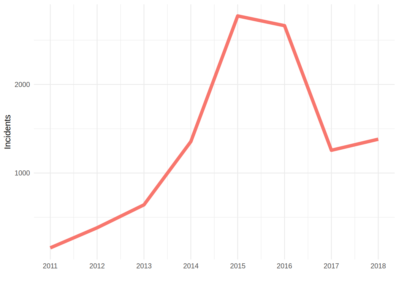
I will plot the total number of strikes per year all over the country to check that what I felt from the gif was real.
ggplot (data = dt, aes (x = year)) +
    theme_minimal () +
    geom_line (aes (y = Incidents_year_total, color = chinaRed),
               show.legend = F,
               size = 2) +
    scale_x_continuous (breaks = unique (dt$year)) +
    labs (x = "",
          y = "Incidents")
Indeed there is a steep decrease in number of strikes. Too sharp to ignore it, if you ask me. Now, more questions enter in my head. Are these changes more abrupt specifically for some provinces?
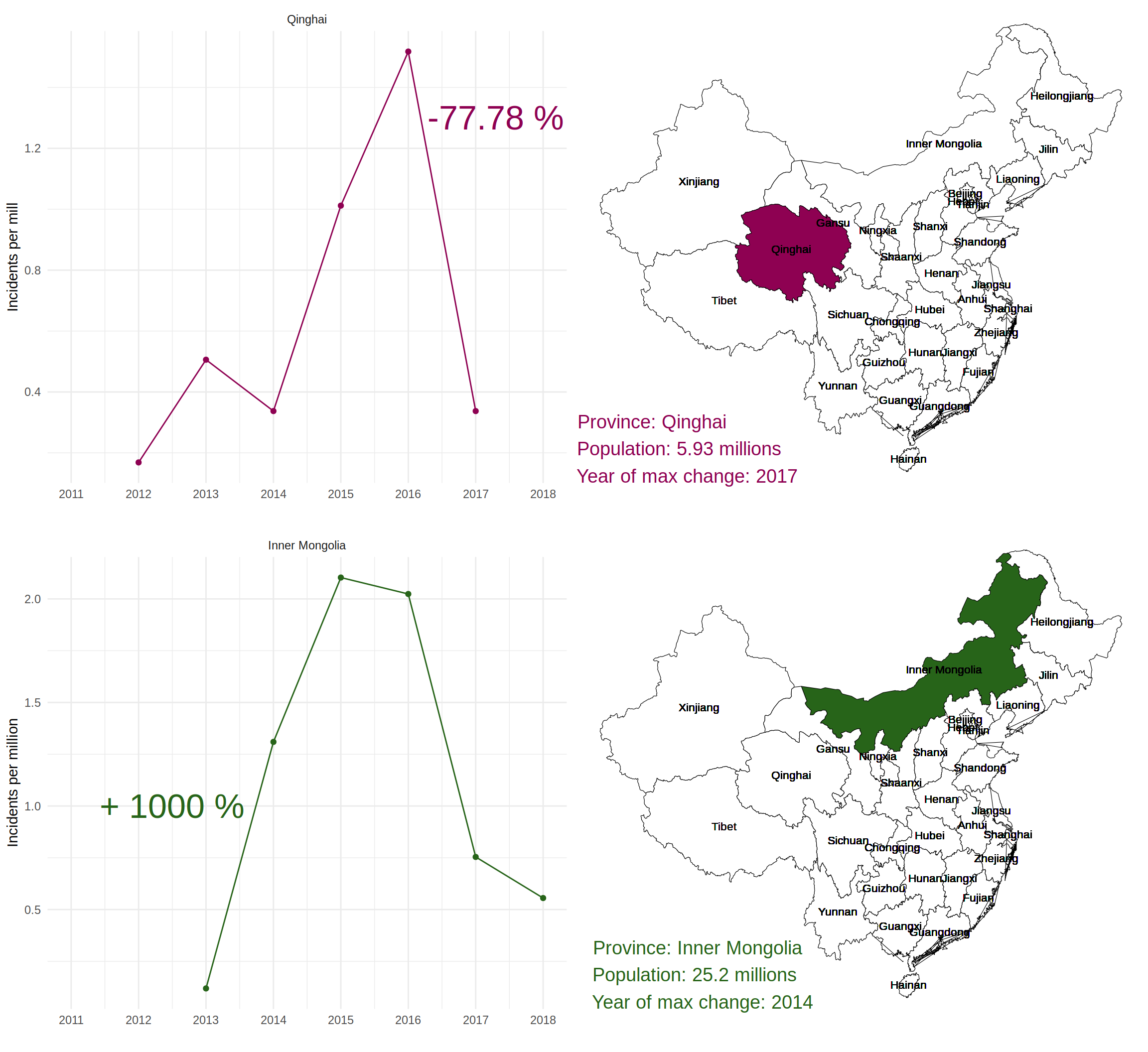
Now, I will check where the tendency is more noticeable or more abrupt. I will find these provinces and highlight them on the map.
tendProv <- dt [, unique (Incidents_per_province_mill_year),
                by = .(year, Province)]

setnames (tendProv, "V1", "Incidents_per_province_mill_year")

tendProv <- as.data.table (tidyr::complete (tendProv, year, Province))
tendProv <- tendProv [, .SD [order (year)], by = Province]

tendProv [, prevYearProv := shift (Incidents_per_province_mill_year, n = 1, type = "lag"),
          by = Province]
tendProv [, prevChangeProv := ((Incidents_per_province_mill_year - prevYearProv) * 100) / prevYearProv]


mi <- min (tendProv$prevChangeProv, na.rm = T)
mx <- max (tendProv$prevChangeProv, na.rm = T)
minProv <- tendProv [prevChangeProv == mi][, Province]
maxProv <- tendProv [prevChangeProv == mx][, Province]

plotMin <- ggplot (data = tendProv [Province == minProv],
                   aes (x = year, y = Incidents_per_province_mill_year)) +
    theme_minimal () +
    geom_line (colour = chinaRed) +
    geom_point (colour = chinaRed) +
    annotate ("text", label = paste (round (mi, 2), "%"),
              x = 2017.3,
              y = 1.3,
              size = 9, colour = chinaRed) +
    scale_x_continuous (breaks = unique (tendProv$year)) +
    facet_grid (. ~ Province) +
    labs (x = "",
          y = "Incidents per mill")

mapMin <- ggplot (data = mapData,
                  aes (map_id = id,
                       fill = mapData$Province == minProv,
                       labels = Province)) +
    theme_void () +
    geom_map (map = mapGeoFort, color = "black", size = 0.2, show.legend = F) +
    expand_limits (x = mapGeoFort$long, y = mapGeoFort$lat) +
    geom_text (aes (label = Province, x = long_province, y = lat_province), size = 3) +
    scale_fill_manual (values = c("white", chinaRed)) +
    annotate ("text",
              label = paste ("Province:",
                             mapData$Province [mapData$Province == minProv][1],
                             "\n          Population:",
                             mean (mapData$Population [mapData$Province == minProv], na.rm = T)/1e6,
                             "millions",
                             "\n            Year of max change:",
                             tendProv [tendProv$prevChangeProv == mi]$year[1]),
              x = 80, y = 20, size = 5, colour = chinaRed)


plotMax <- ggplot (data = tendProv [Province == maxProv],
                   aes (x = year, y = Incidents_per_province_mill_year)) +
    theme_minimal () +
    geom_line (colour = chinaGreen) +
    geom_point (colour = chinaGreen) +
    annotate ("text", label = paste ("+", round (mx, 2), "%"),
              x = 2012.5, y = 1,
              size = 9, colour = chinaGreen) +
    scale_x_continuous (breaks = unique (tendProv$year)) +
    facet_grid (. ~ Province) +
    labs (x = "",
          y = "Incidents per million")

mapMax <- ggplot (data = mapData,
                  aes (map_id = id,
                       fill = mapData$Province == maxProv,
                       labels = Province)) +
    theme_void () +
    geom_map (map = mapGeoFort, color = "black", size = 0.2, show.legend = F) +
    expand_limits (x = mapGeoFort$long, y = mapGeoFort$lat) +
    geom_text (aes (label = Province, x = long_province, y = lat_province), size = 3) +
    scale_fill_manual (values = c("white", chinaGreen)) +
    annotate ("text",
              label = paste (" Province:",
                             mapData$Province [mapData$Province == maxProv][1],
                             "\nPopulation:",
                             mean (mapData$Population [mapData$Province == maxProv], na.rm = T)/1e6,
                             "millions",
                             "\n  Year of max change:",
                             tendProv [tendProv$prevChangeProv == mx]$year[1]),
              x = 85, y = 20, size = 5, colour = chinaGreen)


plot_grid (plotMin, mapMin,
           plotMax, mapMax)
There was a impressive growth of strikes of a +1000% in the Inner Mongolia between 2013 and 2014. However, it’s even more worrisome the reduction of the number of strikes per million of residents in Qinghai from 2016 and 2016, during the same period all over China.
Is this reduction equivalent through all the industries?
By industry type
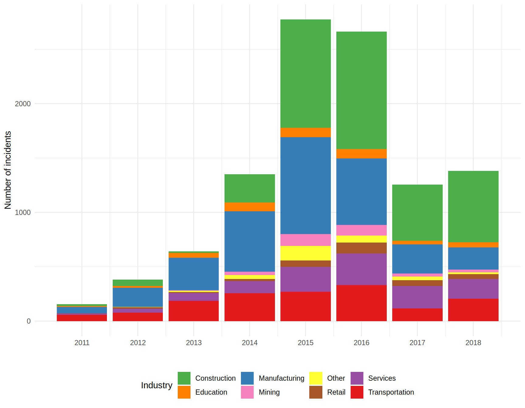
Once I have the dataset clean (thanks CBL!), it’s easy to just plot the number of incidents all over the country differentiating by each industry.
# I create a palette so colors are consistent through all the plots
industries <- unique (dt$Industry [dt$Industry != ""])
cols <- brewer.pal (name = "Set1", n = length (industries))
names (cols) <- industries

ggplot (data = dt [dt$Industry != ""], aes (x = year, fill = Industry)) +
    theme_minimal () +
    theme (legend.position = "bottom") +
    geom_bar () +
    labs (x = "",
          y = "Number of incidents") +
    scale_x_continuous (breaks = unique (dt$year)) +
    scale_fill_manual (values = cols)
Looking at the graph it’s easy to spot the reduction in strikes from 2016 to 2017. It seems that every industry suffered fewer incidents in 2017, but perhaps construction, manufacturing, and transportation are the ones that add more to that difference. I will focus on them for now.
But why the reduction? Perhaps they had strong reasons and the mobilizations were organized often and the claims were common all over China in 2016, but they were solved by 2017? One way to know it would be to check the Chinese news and find the answer. However, perhaps I can find some insights from the dataset.
One of the variables from the original CBL’s dataset was the official response from the government or the company. What if a negotiation was carried out and an agreement reached after the strike?
indus <- dt [Industry %in% c("Construction", "Manufacturing", "Transportation")]

# Some of the responses were in Chinese. To obtain the most of the information,
# I used an automatic translator to get the response in plain English.
indus [`Response to Collective Action` == "公司态度十分强硬",
       `Response to Collective Action` := "The company's attitude is very strong"]
indus [`Response to Collective Action` == "员工败诉",
       `Response to Collective Action` := "Employee lost"]
indus [`Response to Collective Action` == "国信集团和工人开会,在会上向工人提出最后通牒,
       又要对工人强行安置,让工人去新酒店打卡,否则按旷工处理,连续三天矿工就要开除。",
       `Response to Collective Action` := "Guoxin Group and workers meet, at the meeting to put
       forward an ultimatum to workers, but also forced placement of workers, so that workers go
       to the new hotel card, otherwise according to absenteeism treatment, for three consecutive
       days the miners will be expelled."]
indus [`Response to Collective Action` == "地方政府墊資",
       `Response to Collective Action` := "Local government funding"]
indus [`Response to Collective Action` == "工人代表被人控制带走",
       `Response to Collective Action` := "Worker representatives are taken away"]
indus [`Response to Collective Action` == "员工败诉",
       `Response to Collective Action` := "Employee lost"]
indus [`Response to Collective Action` == "开发商携百余人持械殴打讨薪民工",
       `Response to Collective Action` := "Developers carry more than hundred people armed assault
       to pay migrant workers"]
indus [`Response to Collective Action` == "法院不予支持,终审判决驳回各上诉人的上诉,维持原判",
       `Response to Collective Action` := "The court did not support it, the final judgement
       dismissed the appellant's appeal and upheld the sentence"]

indus$`Response to Collective Action` <- factor (indus$`Response to Collective Action`)
By checking the responses, I realized that there are 59 different ones. They seem a lot, but considering that we have 8169 cases, there must be some grouping done by the people at CBL.
I checked some of them and found some of them are common among strikes, but they are combined or worded slightly different. Perhaps the most common responses by the government are “Arrests”, “Beaten” by the police or private guards, “Government mediation”, “Negotiation” with the company, “Police” intervention, and “Undetermined”.
Now I need to know if some responses are more common in 2016 and that’s the reason of the reduction of strikes in 2017. Let’s extract the messy info and take a look.
indus$Arrest <- ifelse (grepl (x = indus$`Response to Collective Action`,
                               pattern = "Arrest", ignore.case = T), 1, 0)

indus$Beaten <- ifelse (grepl (x = indus$`Response to Collective Action`,
                               pattern = "Beaten", ignore.case = T), 1, 0)

indus$`Goverment mediation` <- ifelse (grepl (x = indus$`Response to Collective Action`,
                                              pattern = "Government Mediation", ignore.case = T), 1, 0)

indus$Negotiation <- ifelse (grepl (x = indus$`Response to Collective Action`,
                                    pattern = "Negotiation", ignore.case = T), 1, 0)

indus$Police <- ifelse (grepl (x = indus$`Response to Collective Action`,
                               pattern = "Police", ignore.case = T), 1, 0)

indus$Undetermined <- ifelse (grepl (x = indus$`Response to Collective Action`,
                                     pattern = "", ignore.case = T), 1, 0)

indusMelted <- melt (indus, measure.vars = c ("Arrest", "Beaten", "Goverment mediation", "Negotiation", "Police", "Undetermined"), variable.name = "Response")
indusMelted <- indusMelted [value != 0]

ggplot (data = indusMelted, aes (x = year, fill = Response)) +
    theme_minimal () +
    theme (legend.position = "bottom") +
    geom_bar (position = "fill") +
    geom_rect (xmin = 2015.2, xmax = 2017.8, ymin = -0.016, ymax = 1.016,
               color = "red", size = 1.5, alpha = 0, show.legend = F)+
    labs (x = "",
          y = "% of incidents") +
    scale_x_continuous (breaks = unique (indusMelted$year)) +
    scale_y_continuous (labels = scales::percent) +
    facet_grid (. ~ Industry)
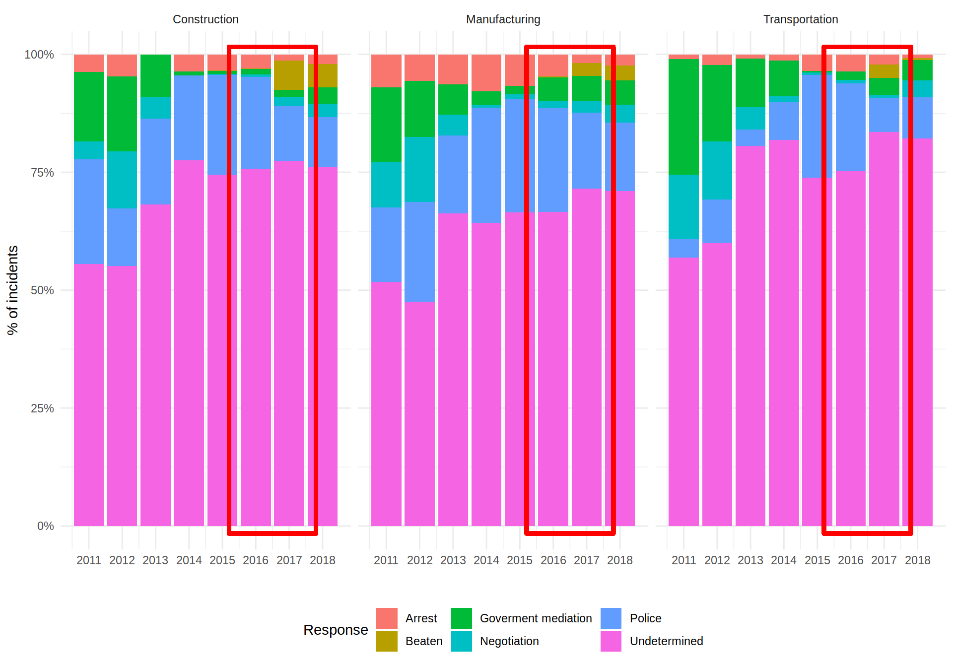
Observing the way the Chinese government have been solving the strikes since 2011, there is a clear tendency of reducing the percentage of incidents solved by governmental mediation and even with mediation with the company.
However, focusing on the year when the number of strikes decreased abruptly, there are two consistent differences between 2016 and 2017 (red rectangles) across the three industries: The percentage of strikes with arrests as a response decreased; also police intervention seemed to decrease although it could be due to temporal variations; and beatings showed up as a way to resolve the incidents.
I will let the reader decide if decreasing the mediation with the company and increasing the beatings of the people is a valid way to almost eliminate any workers claim.
Thanks
Thanks to China labour Bulletin (https://clb.org.hk/) for their efforts to make the information public. Follow them in Twitter.
Also thanks to Natural Earth.
I’m not terrible active, but I tweet news related to data science, specially visualization on JuanM_Ca.